Published February 24th 2018 on the former blog
I often wonder what differentiates Japanese crafts from the ones in China where a lot of them originated. One thing that immediately stood out is the weight of things: Chopsticks for example are much lighter weight than the ones in China or Korea and the same thing goes for Shoji. Shoji are room dividers that were adapted from Chinese folding screens and its origins date back as far as 400 B.C. While the Chinese screens were made from wood, bamboo and rattan which made them opaque and heavy, traditional Japanese screens were and are often still made from rice paper and wood which makes them translucent, lightweight and easily portable.
In a lot of spaces that inspire me I find some interpretation of Shoji that take the traditional form of room dividers to more permanent structures like doors, windows or curtains.
In the following example you see very classic Shoji made of rice paper and wood that act as a curtain in between the windows and the room. You can see many more examples in the work done All Design Architects in Kyoto.

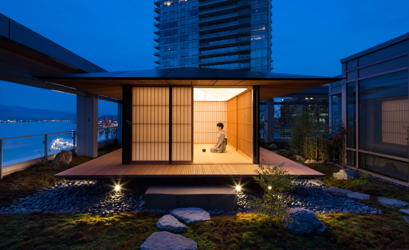
This is a beautifully modern interpretation of a teahouse by Kuma Kengo also using the Shoji with the function of curtains.

In this small studio in Edinburgh I am quite certain that the sliding door dividing bedroom and living room are inspired by Shoji as well. I’m guessing in this case the rice paper might have been either replaced by glass or was simply removed. Fun fact, the Kettle on the stove is a product from Japan I posted about (on Twitter, Instagram, Facebook) a few weeks ago.

Another example in a private residence by All Design Architects is showing a door separating the dining room from the corridor.

This apartment in Tokyo takes advantage of the portability of Shoji and enables many ways of dividing a room.

If you’re ever in Kyoto, you should visit the Leica store located in the famous Gion district. The store is located in an old townhouse (Machiya) but the interior is very mid-century modern. This room showcases how 3 interpretations of Shoji’s can be used in the same space. The divider in the center of the room is a product by Yoshihara Woodworks but it looks like they don’t list the product on their site anymore (neither on the Japanese nor on the English one).

A technique that takes Shoji design to the next level is called “Kumiko”. An example of how that could look can be seen at Aburiya in Hokkaido done by Tanihata.

There are a lot more inspiring interpretations but I’ll leave you with this for now. If you’d like to share your own related discoveries or would like to see more I’d be happy to connect!
